March 22, 2020
Two Views of the COVID-19 Crisis
I have posted an interactive chart of USA COVID-19 cases.
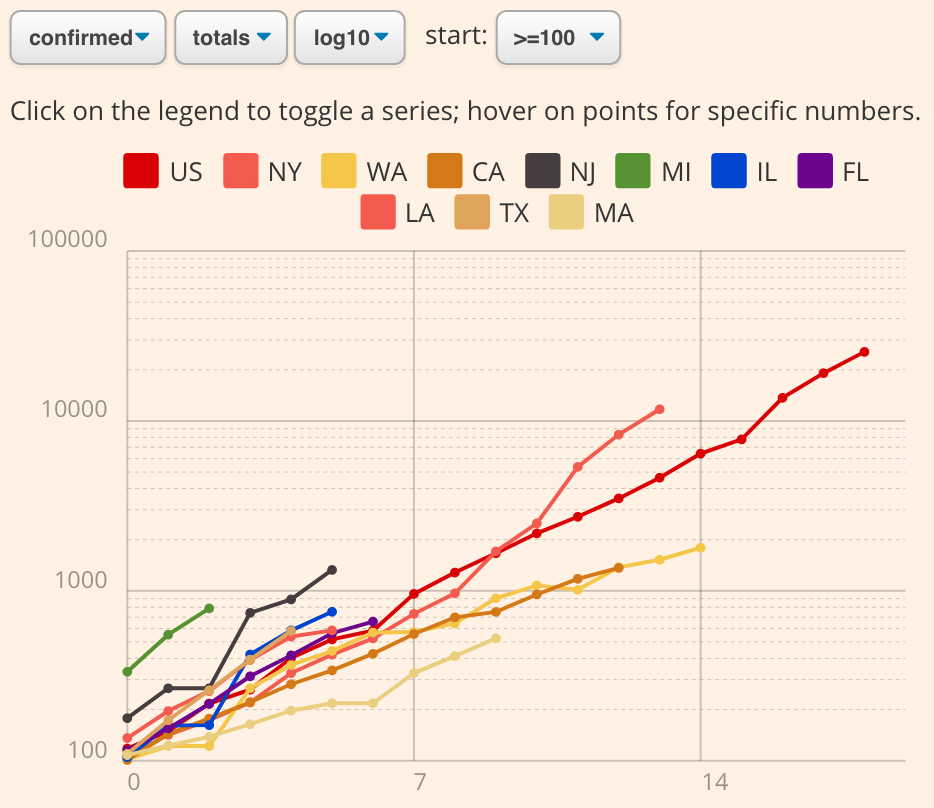
This chart lets you see coronavirus data from two different points of view: the policymaker's view, and the doctor's view.
For policymakers, the chart lets you see USA data in the same way the Financial Times COVID-19 plot by John Murdoch compares policies internationally. Select the logarithmic totals with a '>=100' starting threshold, so that "day zero" is the first day there are 100 cases in a state. Over time, if different states' policies have different effects on the growth of the virus, the exponents, and therefore the slopes, will reveal the differences.
The other point-of-view is the doctors-eye view. Doctors must deal with the patients who walk into the ER and who who lie sick in ICU beds. To anticipate these numbers, switch to the 'delta linear' view in the current month. The spikes show why the panic is justified, and why minor policy changes have massive ramifications.
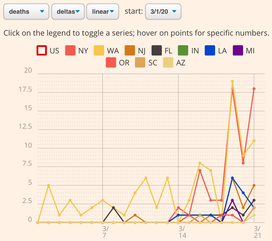
The takeaway? The chart re-emphasizes the point that this is not a game. There is a huge gap between the "policymaker's" view and the "doctor's" reality on the ground. Slight changes from a policymaker's point of view have massive ramifications for doctors.
After our leaders negotiate about a "gradual" shutdown of car factories, Michigan illnesses explode. After beaches stay open for one last lucrative spring break party, Florida cases skyrocket. And what begins as a local outrage will become a healthcare shortage, then a nationwide menace. A single idiotic master of the universe could trigger an outbreak that will use up the ventilators that would have saved your grandfather.
In our 50 states we are all linked. Despite dramatically different local policies, it is likely that our rate of infection growth will be largely the same across the country. In coming days, this chart will tell the story of our national interconnectedness.
Please. We need to take the crisis more seriously than we are. Our corporate, city, state, and federal leaders are not doing enough. "Social distancing" of the coastal elite needs to give way to a much more universal regime of physical isolation, enforced shutdowns, shifting of priorities, deferral of debts, and testing, testing, testing, nationwide.
The graph automatically updates every day based on current data. Please share. And please isolate.
I made the chart to help Heidi (who is a surgeon at MGH) see summaries of some USA statistics that are not being plotted in the media. The code is open-source at github.com/davidbau/covid-19-chart. It is just a bit of HTML and JS, and should be easy to extend to show more information. Pull-requests are welcome.
March 23, 2020
No Testing is not Cause for Optimism
Two readings and a thought related to covid-19 testing.
Lack of information requires us to believe two contradictory things at once. From a policy point of view, we need to understand that very few people are infected yet. And from a personal behavior point of view, we need to understand that many people are already infected.
Policy first. Some people think that the lack of testing means that there could be far more asymptomatic cases than we know, and therefore the disease could far less deadly than we imagine.
But consider the case of the town of Vò, near the epicenter of the Italian outbreak, where all 3000 residents were tested. As severe as the outbreak is in Italy, it corresponded to less then 3% of the population being infected. So as bad as the Italian case is, at least in the one town that was tested, it could be 30 times worse. Blindness is not cause for optimism.
Which individuals should be tested? The right behavior is to do the things that maximize lives saved. That means testing should be done in situations where it would change care, for example on on healthcare providers who do not have the option to isolate, so that they do not inadvertently spread it to other providers and patients.
But of course that means many infected people will be untested, so everybody needs to operate under the assumption that we are all infected.
Paradoxically this lack of information means we need to keep in mind two different realities at once. First, we need to recognize that almost nobody has it yet, so the society-wide damage can and will get far far worse; and second, that we and others are likely to have it, so our personal risk and responsibility is very high. We need to isolate.
The parable of two realities corresponds to the logarithmic and linear view of the disaster. I have posted an updated version of the covid-19 time series tracker, which provides both views on covid19chart.org.
March 24, 2020
The Beginning
Today marks the beginning of the COVID-19 crisis for me. It is the first day that surgeons are being called in from their regular duties to take care of the wave of COVID-19 patients at MGH. Heidi needs to run into the hospital. We will have weeks or months of this ahead.
I am terrified.
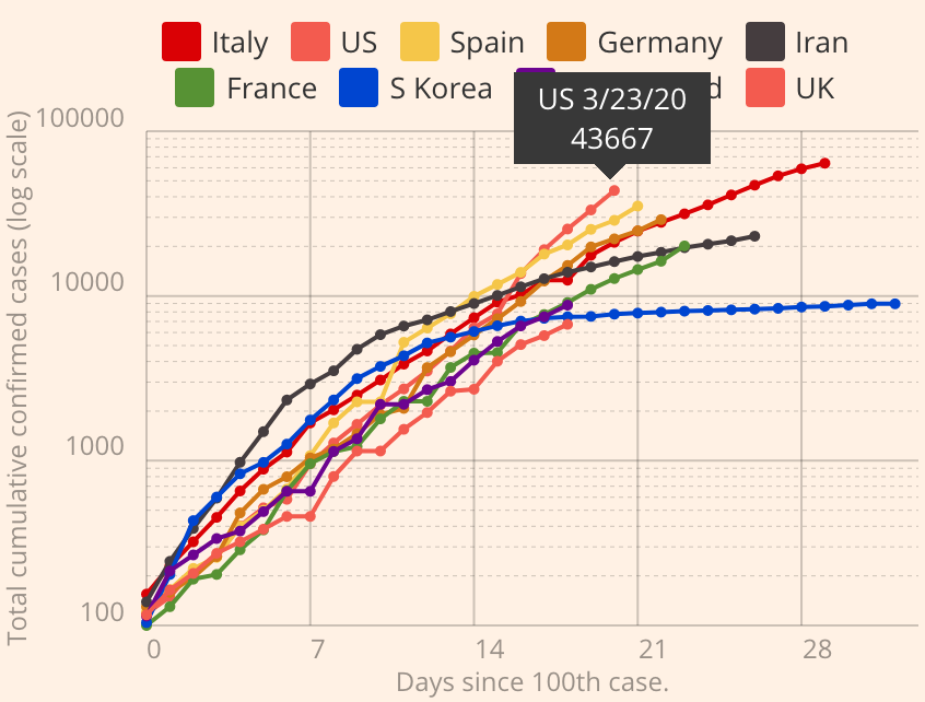
The COVID-19 chart has been updated to include both state-level and international statistics, and it includes an API so that you can make, link, and embed a custom chart that focuses on the states or countries of your choice. The (no doubt stressed-out) CSSE team has been screwing up the data feed, but I will keep the data cleaned and correct on the live chart as long as it can be patched together. Below we can see America first in the chart today.
Please use it as a tool to pressure your local policymakers to take this crisis seriously.
Thank you.
March 25, 2020
COVID-19 Chart API
Here is the COVID-19 Live Chart API. Use it to create a custom live chart of COVID-19 stats on a linear or logarithmic scale, comparing the set of countries and states that you choose (or an automatically sorted set of worst states or countries), on the timeframe that you want to see.
New 3/27/20: You can now plot local data of most US Counties. Just type the counties, states, and countries you want to see into the search box, and you can make a custom graph focused on the localities you care about.
It is designed to help you use current data to anticipate the future. Click on "advanced options" on covid19chart.org. It just takes a few clicks to make a new visualization.
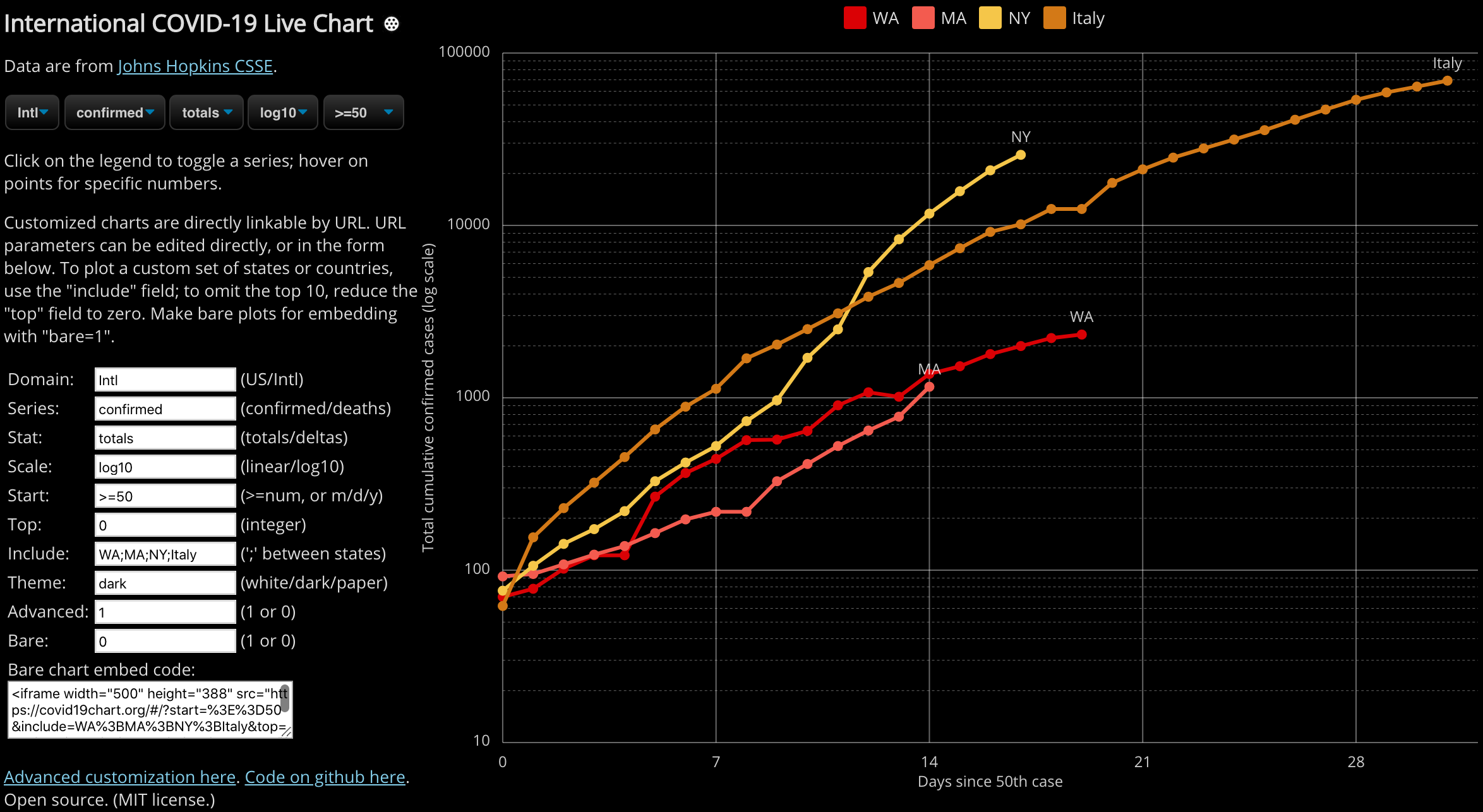
Once you have created a custom chart, you can email it or print it for your local policymaker. Or better yet, if you are making a dashboard that leaders will see every day, theme the graph dark or light to match your webpage, use the "bare" mode for embedding it as an iframe, like this:
<iframe src="https://covid19chart.org/#/?start=%3E%3D50&include=WA%3BMA%3BNY%3BItaly&top=0&domain=Intl&theme=dark&bare=1" width="500" height="388"></iframe>
(The embedded chart is interactive.)
The data is live, pulled directly off Johns Hopkins CSSE COVID data feed on github. Although that feed is in flux and changes format every few days, I will track their changes and the chart up-to-date as needed. Please email me (david.bau@gmail.com) if you have any problems with this API.
The current data tell a simple story.
In the US, if we want to avoid a grim future, we need to be making better decisions now. Every state of our country is seeing a similar exponential explosion, just starting on different days. Please use these charts to tell this story. And thank you for helping our leaders understand the importance of our choices today.
Continue reading "COVID-19 Chart API"