March 25, 2020COVID-19 Chart APIHere is the COVID-19 Live Chart API. Use it to create a custom live chart of COVID-19 stats on a linear or logarithmic scale, comparing the set of countries and states that you choose (or an automatically sorted set of worst states or countries), on the timeframe that you want to see. New 3/27/20: You can now plot local data of most US Counties. Just type the counties, states, and countries you want to see into the search box, and you can make a custom graph focused on the localities you care about. It is designed to help you use current data to anticipate the future. Click on "advanced options" on covid19chart.org. It just takes a few clicks to make a new visualization. 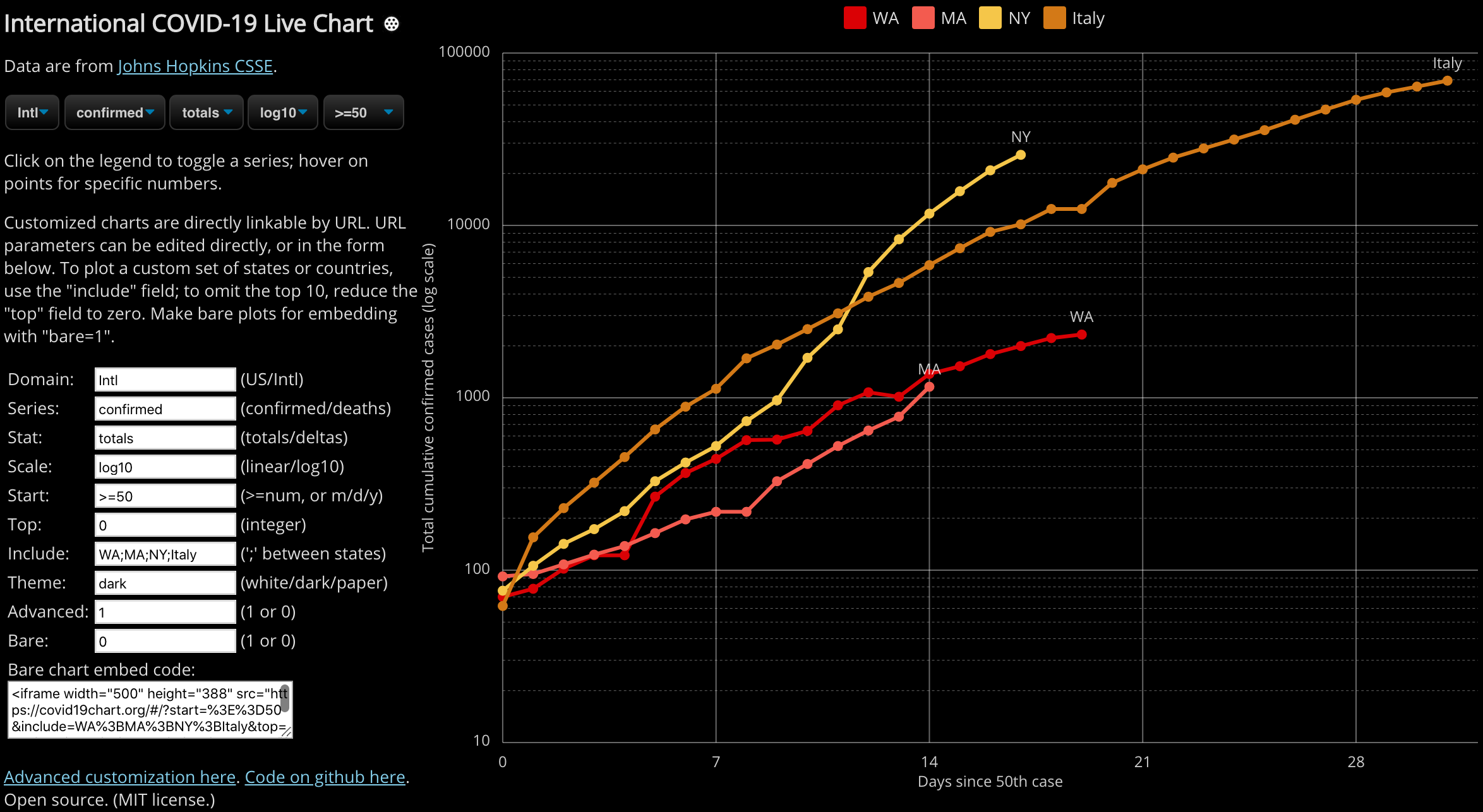 Once you have created a custom chart, you can email it or print it for your local policymaker. Or better yet, if you are making a dashboard that leaders will see every day, theme the graph dark or light to match your webpage, use the "bare" mode for embedding it as an iframe, like this: <iframe src="https://covid19chart.org/#/?start=%3E%3D50&include=WA%3BMA%3BNY%3BItaly&top=0&domain=Intl&theme=dark&bare=1" width="500" height="388"></iframe> (The embedded chart is interactive.) The data is live, pulled directly off Johns Hopkins CSSE COVID data feed on github. Although that feed is in flux and changes format every few days, I will track their changes and the chart up-to-date as needed. Please email me (david.bau@gmail.com) if you have any problems with this API. The current data tell a simple story. In the US, if we want to avoid a grim future, we need to be making better decisions now. Every state of our country is seeing a similar exponential explosion, just starting on different days. Please use these charts to tell this story. And thank you for helping our leaders understand the importance of our choices today. Some more technical details The webpage is a simple static HTML web page, hosted on github pages. In addition to the embedding API, it is fine to just take and copy the code - it is open source, MIT license, code here on github. It is pretty well self-contained, so if you want to use the graph on your site without linking, please take it. If you make improvements, pull requests are welcome. It includes some useful pieces that might be useful if you are doing your own visualization. For example as noted in this bug, it contains some potentially useful functions that deal with the mess of evolving CSSE time series feed formats. Where is China? For various reasons China data is not easy to compare to other countries and is omitted by default. But if you open Advanced mode, you can type in "China" explicitly to add that series and (separated by semicolons) any other country such as "Singapore". In this interface South Korea is spelled "S Korea", and the United Kingdom is "UK". Posted by David at March 25, 2020 10:46 AMComments
escorts madrid This has really affected my lead generation businesses in Dallas and I hope that it all comes to an end soon! Posted by: Jeff Haynes at May 18, 2020 05:34 PMSince the start of this madness nothing has gone right. I cant get drywall repair near me for my home because nobody wants to come out, grocery shopping is a hassle and teaching children is a lot harder than you'd think. Posted by: Vanessa Tisdale at May 18, 2020 05:40 PMAwesome content Posted by: Trade marketing at May 20, 2020 12:32 AMCOVID 19 came in and completely changed our lives as we knew them. I'm lucky to have worked in hardscaping and patio design at a time people renovated their homes, but I know many people that have lost their jobs and really struggled through 2020. Posted by: Jack Harley at October 20, 2020 06:04 PMPost a comment
|
| Copyright 2020 © David Bau. All Rights Reserved. |